Business Central: Mastering Matrix Table Visuals in Power Bi
- Alan Campbell
- Nov 22, 2023
- 4 min read
Welcome to our blog, where we explore the dynamic relationship between Business Central and Power BI, two powerhouses in the realm of business intelligence and data visualization. This blog is dedicated to those who seek to harness the synergy of these tools to create compelling and informative data presentations.
At the core of our discussions is the critical role of the date table in Power BI, especially when dealing with data from Business Central. The creation of a date table is not just a technical step; it's a strategic move that unlocks the full potential of data visualization in Power BI. By focusing on this essential element, we aim to empower you with the knowledge to effectively present your data in a matrix table visual, a format known for its versatility and clarity.

Understanding the interplay between Business Central data and Power BI’s visualization capabilities is key to crafting insightful reports. We delve into the nuances of extracting and transforming Business Central data to seamlessly integrate it into Power BI. This blog serves as a guide to not only create but also to optimize the use of a date table, ensuring that your matrix visuals are not just visually appealing but also rich in meaningful insights.
Our journey begins with a step-by-step guide on setting up your environment, emphasizing the importance of loading crucial Business Central tables like customers and itemLedgerEntries into your Power BI Report. This foundational step sets the stage for more advanced data manipulation and visualization techniques.
We then guide you through the creation of the Date Table, a pivotal component that facilitates time-based data analysis in your matrix visuals. This includes detailed instructions on using DAX code to create and manipulate this table, ensuring that your data is displayed in a context that highlights trends, patterns, and anomalies over time.
Furthermore, we explore the creation of table relationships, a critical aspect of data modeling in Power BI. These relationships are vital in correlating data from Business Central, allowing for a multidimensional view of your business metrics.
Finally, we demonstrate how to bring it all together in the creation of a matrix visual. This step is where the magic happens, transforming your structured data into a powerful visual tool that offers deep insights at a glance.
Whether you are a business analyst, a data enthusiast, or someone who is just starting to explore the capabilities of Business Central and Power BI, this blog is designed to provide you with the tools and knowledge to transform your data into compelling stories. Join us in this journey of discovery, where data meets design, and insights come alive.
Prerequites for building this solution in Power Bi
To build this solution you will first need to have loaded both the Business Central customers and itemLedgerEntries tables into your Power Bi Report.
Creating the Date Table
We will now create a Period column in a date table that will we will use for our column value when we create the Matrix visual in a later step.
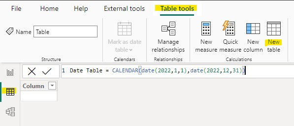
1. Click on New table underTable tools in the top menu in the Table view. Enter DAX code as follows:

Date Table = CALENDAR(date(2022,1,1),date(2022,12,31))
2. Click on New column in the top menu and enter the following code to create your Period column:
Period = year('Date Table'[Date]) & "-" & right("00" & Month('Date Table'[Date]),2)Creating Table Relationships
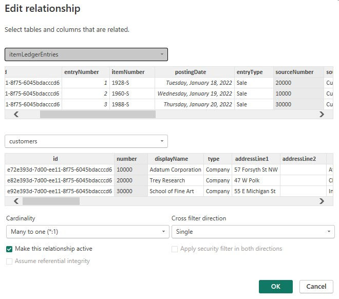
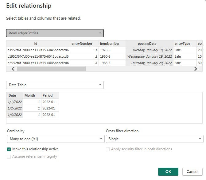
We now need to create the relationships between the customers, itemLedgerEntries, and Date Tables.
3. Create the relationship between the customers and itemLedgerEntries tables in the Model view as shown below:

4. Create the relationship between the Date Table and the itemLedgerEntries table.

Creating the Matrix Visual
In this section we will create the matrix table visual that will show the customers, itemLedgerEntries, and Date tables.
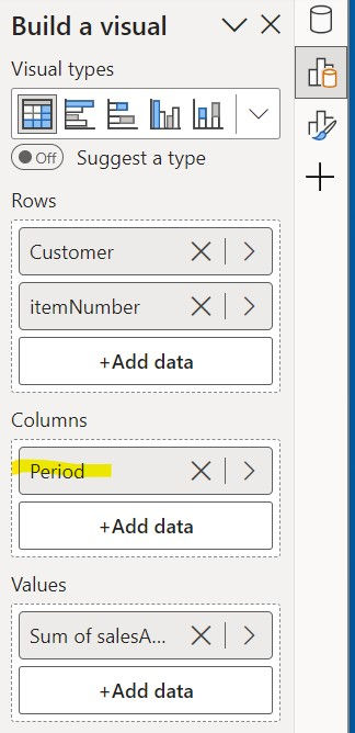
5. Under the Report view add a Matrix visual to your page. Add fields from the customers and itemLedgerEntries tables to the report in the Build a visual pane as show below:
Add the displayName from the customers table to Rows
Add the itemNumber from the itemLedgerEntries table to Rows
Add the Period from the Date Table to Columns
Add the salesAmountActual from the itemLedgerEntries table to Values

Conclusion
As we conclude our exploration into the world of data visualization with Business Central and Power BI, we hope this blog has provided you with valuable insights and practical steps to enhance your data reporting capabilities. The journey we've embarked on together highlights the transformative power of a well-structured date table and its pivotal role in crafting effective matrix visuals in Power BI.
Through this blog, we've delved into the intricacies of manipulating Business Central data, emphasizing the significance of a strong foundational setup by loading crucial tables into Power BI. We've walked you through the creation of a robust Date Table, an indispensable tool for any data analyst, and demonstrated how to harness DAX code to bring your data to life.
The establishment of relationships between your Business Central tables within Power BI is not just about connecting data points; it's about weaving a story that your data tells. We showed you how to create these vital connections, ensuring a holistic view of your business metrics.
In the creation of the Matrix Visual, we brought together all the elements of our discussion. This is where your data storytelling reaches its peak, providing you with a powerful tool to communicate complex information in an intuitive and impactful manner.
Our goal has always been to empower you, whether you're a seasoned analyst or a newcomer to the realm of Business Central and Power BI. We hope that the steps and strategies shared here will serve as a springboard for your own data visualization projects, enabling you to transform raw data into meaningful narratives.
Remember, the journey in data visualization is continuous, and there's always more to learn and explore. We encourage you to experiment, innovate, and share your experiences with the community. Keep an eye on this blog for more insights, tips, and guides in the future. Thank you for joining us on this journey, where data meets design, and stories come to life through the power of visualization. Happy analyzing!
Comments